GLASS DOOR GALLERY
“Winter Hours” Exhibition through January 5, 2014
245 Columbus Avenue, San Francisco
Tuesday-Saturday 12-7, Sunday by appointment
Review by STEVEN SIMMONS
In an exhibition titled “Winter Hours” at the innovative and eclectic Glass Door Gallery in North Beach the curators have selected works that, according to them, “explore salvage and reconstruction, order and disorder, temperature and mood.” In their widely different explorations of these themes three veteran Bay Area artists in the show stand out: Ronald Chase, Carl Heyward, and Joan Stennick
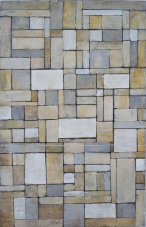
Of the three Ronald Chase is the oldest and the best known – as an independent filmmaker, a photographer, an opera designer, and an educator as well as a painter. At the Glass Door he is showing four fiercely elegant paintings he calls “History Lesson”[s]. Three of these are vertically oriented adventures on the grid. Using a color palette of ochre, gray, tan, white and black Chase creates a picture plane composed of small abstract rectangles of varying shapes, rather like an early Mondrian. The power of the work comes its playing off order against disorder, from the tension between the precision of the geometry and Chase’s rough and “painterly” brushstrokes within and across it. Sometimes a mass of paint moves from one rectangle to another, at other time paint drips vertically across the lines of the grid.
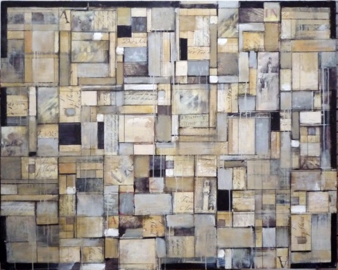
Chase’s fourth (and at 60 x 47 inches the largest) History Lesson shares with the others the grid-like form, the subdued colors, and the deliberately rough painting. Here, though, the orientation is horizontal; black shapes become a kind of frame around much of the painting’s edge; and Chase introduces touches of subdued red in some of the painting’s lettering. Yes, lettering, because in this piece Chase has pasted parts of journal pages within selected rectangles.
The content of these pages vary from fragments of German, Italian, and English phrases, to musical notes, to tiny drawings of buildings, cityscapes, fauna and flora. Because of the magisterial combination of the geometric abstraction and the historical (i.e., autobiographical) content this is the most powerful of Chase’s Lessons.
ronald chase : collage # 7
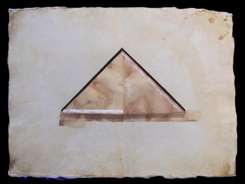
The other two pieces of Chase’s in the Glass Door Show are large (35x 27 inches) collages composed mainly of incised, raised, and neutrally colored composition paper. Each of these has a single shape in its center: a triangle in one, a horizontal crescent in the other. Both are deceptively simple and both are very beautiful.
*
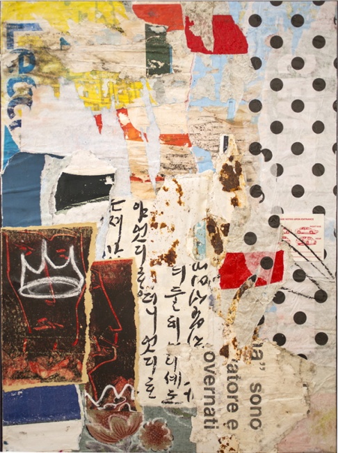
UNTITLED (crown) Carl Heyward
carl heyward
*
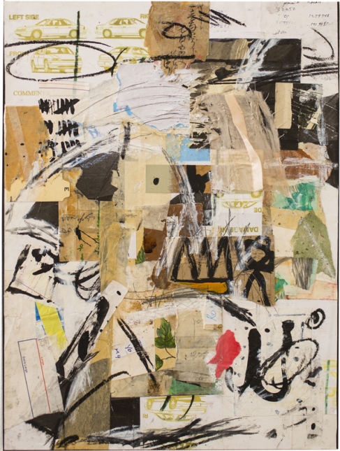
Like Ronald Chase’s, Carl Heyward’s oeuvre straddles a number of disciplines, in his case writing, photography, conceptual art, digital graphics, and mixed media collages. It is six of the latter, all 18 x 24 inches, which he’s exhibiting at the Glass Door.
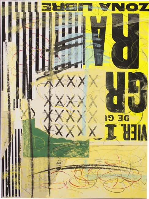
The incorporation of “texts” is as important in Heyward’s work as it is in some of Chase’s, but in contrast to Chase’s use of very personal written and drawn material, Heyward’s use of words and images is more about art and social history. He does not hide his artistic forbearers, most prominently mid-century American ones, including the op and pop artists as well as Rauschenberg and Johns. Heyward’s collages here salvage and reconstruct in new contexts a wide range of cultural material, including contemporary advertisements, vintage anatomical drawings, old sepia-tinted photographs, Chinese calligraphy, Latin posters, construction paper, floral wallpaper, a ribbon. In contrast to Chase’s carefully controlled artistic compositions, Heyward’s are exuberantly loose, at times almost anarchistic. While Chase’s color palette is consistently subdued, Heyward’s is varied, brilliant, and at times almost florescent.
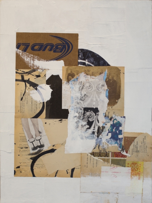
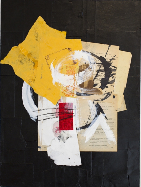
Heyward’s best work here is probably his most boldly executed yet most simply composed, for example, a stunning two panel work called “A Two Enso Evening.” “Enso” is a meditative Zen practice based on a circle that includes both light and darkness, and here Heyward explores the contrast between the two by painting the background of one collage gleaming black, the background of its companion piece gleaming white. Against both he has juxtaposed fragments of various and radically disparate types of paper (including, for example, part of a yellowed page of a translation from Chinese to English, part of a used and crumpled mailing envelope, part of a cardboard logo for Bud Light), which form incomplete circles across the paper and suggest that only fragments of a Zen circle are now possible.
In another fine piece, against a background of acid yellows and blues and greens, Heyward uses thick black lines, “X”s, and word fragments (“ZONA LIBRA”- upside down) to create a work that is exuberantly jazzy, tropical, and both politically and poetically evocative.
JOAN STENNICK / ARTIST STATEMENT:
In these paintings I track an interior landscape with varied levels of connection to physical reality; never planned in advance, but allowing it to happen as it emerges…when it feels right in my body… and making the mark when I see the shot.
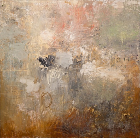
Joan Stennick is one of the best abstract painters currently working in the Bay Area. Her work demonstrates how much visual complexity and emotional power can be found in the kind of bold, risk-taking abstraction she practices, how alive and up to the minute the tradition of gestural painting can be.
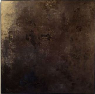
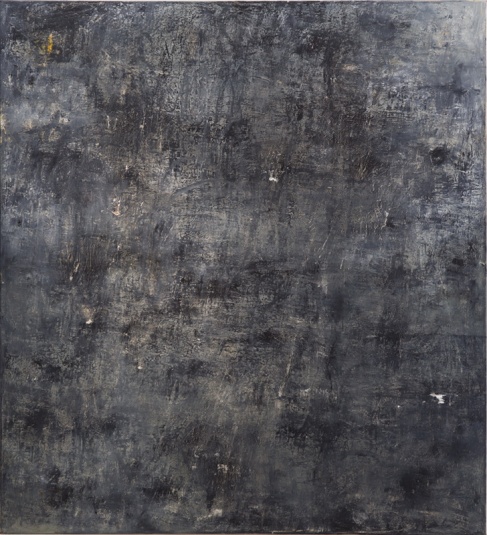
Two years ago a Stennick exhibition at the Bonnafont Gallery was dominated by a series of predominantly black paintings. There are three of these at the Glass Door in which, as the artist puts it, “sign posts, scraping, adding, subtracting and punctuating” create canvases that both pulse with energy and yet resolve themselves into serene wholes. Of course, none of these are entirely black. They’re punctuated, so to speak, with patches of pale color (white, silver, putty) that shine through the black like lights in the darkness.
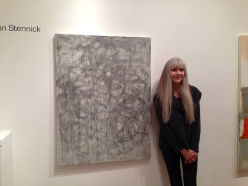
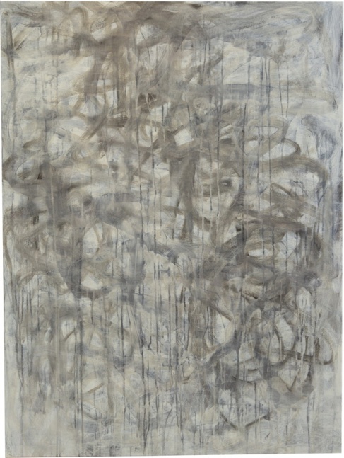
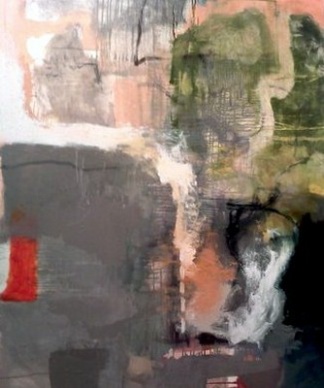
In two of the finest of Stennick’s new paintings at the Glass Door she moves away from the means and methods of the black paintings, not only in her introduction of color but in her abandonment of “overall” composition in which no element stands out more dominantly than any other. In a large and very fine, vertically oriented work of grays, whites, gray-greens, and pale greens it’s as though one picture plane is imposed over another. In the background are a series of stumbled slashes and swirls of paint, in the foreground a series of mainly vertical drips. Or is it the other way around? In any case one reads the drips and swirls separately, as occupying two different but overlapping spaces.
An even more daring departure from the black pieces is Stennick’s largest (48 x 58 inches} canvas here, one in which she proves herself a master of color. At the top and on the right side of the painting areas of pinks and various shades of green sometimes overlap, sometimes butt up against areas of black, white, pale grays. The composition is dominated by and somehow made complete by a smallish reddish orange rectangle embedded in charcoal on the lower left side of the canvas.
My immediate response was one of joy: Hello Gorgeous!!
Steven Simmons is the author of the novel Body Blows and a critical study of Jean-Luc Godard, “Modernisms” in Film. His work has appeared in Artforum, The Bay Guardian, Film Comment, Harper’s, and Vanity Fair, among other publications.


Exciting!
Oh how I wish I could see this knockout show in San Francisco at The Glass Door Gallery – wishing you all great success with this grande exhibition
Beautiful works!
Beautiful show,.hence,. The given analysis here of work is critically good. Its a really nice experience to watch and read here. Thank u.
Surely artists who will leave a lasting
mark in the current modern art;
Carl Heyward is converted to beauty and kindness that the destruction and harmony in everyday common.
Joan Stennick swims in the sea of things before they become words.
Thank you for your imagination …..
and Love composition of Ronald Chase … divided the place by suppressed color
congratulations for the good choice of the works that you have share, hope u keep going on this level. and I wish if I can exhibit some of my works in your page
If you are in San Francisco go to this show !
Carl Heyward é um maestro que consegue encontrar a harmonia no meio do caos, vejo-o como um endevidoo realizado.
A visit to the Glass Door should definitely be on your to do list to see the amazing creative and sensitive work of Carl Hayward and his friends and I am delighted to be allowed to follow his original and inclusionary approach to the visual arts…via online media…for some time now..best wishes for a successful exhibition to all
Wonderfully enigmatic work. I love it.
Lovely show with a gentle nod to deconstruction…
Wonderful stuff!
Carl Heyward’s mixed media work is a very clever visual critique of the history of images, and a much need continuation of the former investigations by not only mid-century American experimental artists, but also europeans and most recent ones. He knows what a demanding challenge is for mixed media artists to justify the value of found material, and his way to do it is the careful selection of every element used in his compositions, which achieve a balance between chaos and geometry, the appropriated and the added, the delicate and the raw.
Lutero:
you nailed it…get out of my head !
Sorry. Obviously the word is “needed”. My mistake.
I wrote it in a rush!
Is good to be an artist, art is way of life this are beautiful oil colour works exelent works
Excellent! すばらしい!
Seems like all works of each artist works together beautifully in the space.
Very different from one another, yet all three share powerful creation.
WOW! AMAZING BEAUTIFUL ART WORK!
les collages font décoller
les gens pas sages
Express world by each artists by each manner.
Ronald Chase: simple color,simple space. But it is not very exact line ( like to use a ruler). I very like it. Carl Heyward: By his mixed media visual works, word(typograph) is not only one language. I don’t know message what he wanted to say through his works. I just like his space balance of artworks. Joan Stennick: His works seems a rusty metal piece ( for me). interesting.
Nice and interesting work!
This work fpr sall?
absolutely…contact me via facebook messaging or via Glass Door Gallery…a pleasure
Carl Heyward
Gorgeous collages, Carl!!
Would love to see the show. Images look great and really dig Carl Heyward’s work!
Wonderful, I’m so sorry that we are not able to visit this exposition.
Carl..superbe as usual…
I love it! Inspiring work!
Great show… Congratulations, Carl. I wishing you all the best!!!!
Beautiful work!
Very impressed with everybodies work!Wish you a huge success for the show!
Carl Heyward, what a wonderful nice job, well done. I love collages! Untiteld (crown) is my favorite, I like how you give old things new life into your work!
great project carl, thank you !
Wonderful work!
great stuff, carl
both the work and its environment look very classy ….. ( you deserve it )
-great selection of work featured here! eager to get to San Fran!!
поздравляю Карл !
Супер !!!
Very nice and well deserved write-up for all three artists! I am so glad I got to see the exhibition and meet the artists in the flesh! Congratulations!
Beautiful chaos. Very nice.
Powerful work! Each art piece compliments the others work. I wish I could have been there for the show. It is an honor to know such incredibly talented beings such as Carl Heyward!
Beautiful exhibition, harmonious! Three talented artists ! Congratulations.
Heyward is better than Rauschenberg, Heyward is strong and good, I really like his “confusion vs. balance” fighting semiotic in the everyday / everything / anyhow aesthetic
…your thoughtful written comments touch me deeply; probably more than I would ordinarily care to say….all of us involved in WINTER HOURS, Glass Door Gallery and the artistic community in San Francisco appreciate your visual participation and written responses greatly as we take as succor your perspectives about the work and our positioning in this movement of this exact moment, absolutely a current and present “NOW”.
As musicians, these artists are joined for the same pictorial symphony of creation. The complementarity of the artworks vibrates in “the Universal” by an undeniable freedom of artistic expression. ” The cohesion of creative artists on the same ship!”
I like the work of all the artists but mostly Ilike the work of Carl Heyward .. serious
Very intriguing and exciting stuff! So proud of these artists and honored to call 2 of them good friends! Yay!!!
The reallity in wich we live is horribly bigger than any surreality, fairy tail, deity, poetry or history. Your activity express the smartness of being able interpreting it.
Thank you
Congratulations on this thoughtful review, many insightful comments — tribute to an exciting show.
super Carl_ ‘Zona Libra” & your cool dots & (crown) + Joan’s 2 grey paintings_ super
Very interesting work. I would have loved to se the exhibition…
I feel the screaming ‘nd crying to this cruel world from these art. Greeting !!!! from Japan.
Beatiful !I’m very impressed .. nice indeed.. Tenk you
Thank you 🙂
These three artists works are phenomenal!
i enjoy realy and i love work .thanx
waoooo this is great.keep it up.
Congratulations, Carl! This looks like a great show, all the way around.
Exciting and all fresh.
What a beautiful exhibition.Very strong still touching .
Keeps me curious.
Congratulations Carl & Joan
great works…a lot of interesting different cool works…congrats…love…jaya
Great artwork!
… best wishes from berlin & toi,toi,toi to you happy three …
3 Sedimente der Berührung – Urstoff, Bricolage/Collage, abstrakte Form –
schön & kraftvoll
Wonderful works!! Three talented artists ! Congratulations.
Amazing work Carl!! This looks like it turned out amazing! It would be an honor to do work with you here in the future.
Hourian
https://www.facebook.com/hourianart
Truly wonderful and complementary show! Enjoyed the poetic art of Carl Heyward!
Great exhibition
..congratulation n success..!!
Congratulation n success..!
Excellent work!
thanx for sharing these inspiring images: loved them all. I hope I can see them live sooner or later!
our fondest wish Sara…
The beauty is an deep feeling from the soul of each artist! It´s a luxe (virtual) view these art works. Thanks for sharing and a lot of success
very exciting works!
Nice mature work from accomplished artists..Carl makes collages that seem so natural..Joan, I love your paintings.
cool exhibition!!!
What a wonderful exhibit! Carl, you know I am a fan…and the three of you complement each other beautifully. The rhythms that run through your pieces as a group are dynamite! Bravo!
Sorry for my belated reply Carl. But now Im here and see lots of great pieces from you all. Good job Carl !! All the best. Sophie
Like the red rectangle in the last image, your writing is brilliant and very welcome
Congratulations!! Very interesting high level works. I wish I could see them in real…..
Josée
joan’s paintings feel like calm in the face of adversity-so strong and gentle at the same time.soon she will be called the master of grey-same as yves klein was the master of blue..your collages are fresh and tattered simultaneously-another metaphor of resistance to the soul sucking ordeal of the everyday..the third artist-first in years but for me ‘too crafty’-making it devoid of character-maybe he is at an age when such things give you a peace of mind-and that’s all that matters ..
_____________________________
ANNIE LINDBERG:
Ronald Chase / Carl Heyward / Joan Stennick : WINTER HOURS :
I love the juxtaposition of the work…they so beautifully complement each other; am especially fond of ‘a two enso evening’. thank you! Carl, many thanks for sharing!
Very nice. I enjoyed seeing them all.
Lovely exhibition!
equilibrio
Great sense of reclamation of geography through this series of works. Great collaboration
Very nice, a wonderful exhibit
Excellent.
Trying to see the show before it closes after Christmas.
very excieting exhibit, Congratulations!!
very nice exhibit – excellent work
_______________________
Arthur Birkland:
Great show with inspiring work, congratulations
Wonderful work, very emotional and beautiful. All the best to you and your artistic journey!
Hi Carl, I saw your exhibition at the Glass Door Gallery today and found your work and Joan Stennick’s the most evocative. Your work is fascinating because it is so encompassing; incorporating popular culture while at the same time being very esoteric. Beautiful exhibition at Glass Door Gallery! xo-Geri
very exciting body of work!
very evocative! congratulations to the artists!
I have been following Carl Heyward’s work on Facebook for some time now. I never fail to be excited by his approach to art.
Beautiful work
Beautiful work … congradulations to you Carl for your great art …!!!
Fascinating work ! Congratulations !
A beautiful development of your art Carl.
amazing work 🙂
It’s Magical ….bravo
Excellent, cutting edge work from all 3 Artist. Pray I can get to see the show before the 5th. Carl I love your work. Joan and Ronald you have a new Admirer.
Nice collection of works, thanks for sharing Carl, you’ve got a fan here.
Great work ! Breathtaking !
Excellent work!
The show looks great Carl! Wish I was in SF to see In person!
Beautiful work. I would love to see this show! Congratulations.
wow …so beautiful works … fantastic …+++++
What I would give to see these up close. Looks like a wonderful exhibition!
muy interesante,,, buenas piezas !!
Carl Heyward profond et vivant, imprégné de cette poésie urbaine post-industrielle que j’affectionne… Bravo !!
Carl… Saw your works here at glass door’s exhibition. fabulous… you are a writer too… WISHING YOU A HAPPY NEW YEAR 2014
Carl Heyward I love your work!!! A beautiful exhibition with great artists! Congratulations!
Изумительные фотки,все очень понравились.Вы классный мастер.Новых фото.
Interesting works and artists. Thks for sharing
Congratulations! … very beautiful works, a pleasure to sharing a hug.
Bepodobnye pictures , I really ponravilis.Vy fotograf.Schastya amazing .
Beautiful work all, congratulations Carl on a very smart series.
Excellent article! Cool gallery! Significant and interesting exhibition!!! I wish you the greatest success!!!
Alfiya Akhmerova.
Great works! colorful cosmic riddles!
Although my expertise is in music production, I have always been extremely appreciative of art and photography. Many years ago I had the pleasure of meeting Carl Heyward with regard to the music business and found that he had a diverse interest in many genres of music being jazz, rock, blues or whatever. I can detect from his mixed media approach to art that his appreciation for diversity exists outside of his music influences. As a result, his art is is thoroughly engrossing as your eyes graze upon the images he has presented.
Great work. I really like 🙂
Seems like a great exhibition ! Fascinating collage work by Carl Heyward, very strong and instinctive ! I really love the beautiful mix between paper pieces, brushes strokes, lines and scrawl.
When I saw again, again, again …, even I like their works.
I like your work ! It makes me going on looking at it.
Great works .. I wish I was there …
great!!!
This show looks wonderful! Carl, I hope I will see your work in person soon.
good painting…
Congratulations for your works!
Great works ! I like so much !!!!
I really like these paintings! using less elements and making more charisma admirable!
Exquisite and inspiring exhibition!!!! This show is an amazing balance between three individual and extraordinary artists. All the best for a successful show!!!!
Great works…i wish i were there…
Amzing ! High level of creativity…
Beautiful work. . .asoy!!
Great exhibition, great project! Pity I’m too far away!
Très belle exposition;superbe travail des artistes,mais malheureusement trop loin pour moi!
Congratulations! Great!
Carl Heyward’s Great!! Works!!!
Nice work everyone! Seeing them here… the next (distant) best to seeing them in person. A shout out to Carl, especially – Good work. Thanks for posting! Cathi
http://www.artslant.com/global/artists/show/233534-carl-heyward
Nice work, great creativity!
Whoever wrote the article has nailed it. Added to their words I’d like to say that the unique narrative style of the individual artists compliment each other well as an exhibited body of work. The Glass Door chose wisely. On screen the artworks are a conceptual feast providing variety and imagination. I’d love to see this exhibition in the flesh, so to speak.
Félicitations! Très joli tableaux, très jolie composition, et très jolie gallerie! Je te souhaite une bonne continuation et beaucoup de succès!
Looks to be a fantastic exhibit. Wish I could see it in person.